
Quick answer
A new ecommerce brand needs seven identity essentials: a clear positioning statement, a distinctive and legally clearable name, a flexible logo system, a colour palette with accessible contrast, two or three typefaces, packaging that carries the brand into the customer's home, and a written tone of voice. Capture them in brand guidelines, then apply them consistently in Shopify's brand assets and theme settings.
Key takeaways
- Start with positioning: who the brand is for, what it replaces and why it is different. Visual design follows from that.
- Check a name against trade mark registers in each market, and against domains and social handles, before designing anything.
- Design a logo system, not a single logo: primary, wordmark, icon and favicon versions.
- Pick colours and fonts that pass accessibility contrast checks and load quickly on mobile.
- Write guidelines and set them in Shopify's brand assets and theme settings so every page and channel stays consistent.
New ecommerce founders often start branding with a logo. It feels like progress: something visual, quick to commission and easy to share. But a logo built before the brand knows who it serves usually gets redesigned within a year, along with the packaging and store that were built around it.
A durable identity is built in a specific order: positioning first, then name, then the visual and verbal system, then the rules that keep it consistent. This guide walks through each essential and shows how to apply it inside Shopify, for brands launching in the US, UK or Gulf.
What Is a Brand Identity?
A brand identity is the set of elements a business controls to shape how people perceive it: positioning, name, logo, colour, typography, imagery, packaging and tone of voice. The brand itself is what customers end up believing; the identity is the toolkit you use to influence that belief.
For an online brand the identity does more work than in a shop, because there is no salesperson, shelf or fitting room. The product page, the unboxing and the social feed carry the whole impression.
How Do You Define Brand Positioning?
Positioning is a short statement of who the brand is for, what need it meets, what alternative it replaces and why it is different. Write it before any design work, because every later decision, from colour to copy, should be checked against it.
A simple template works well:
For [specific customer] who [need or frustration], [brand] is the [category] that [key benefit], unlike [main alternative], because [reason to believe].
Be specific. "Women who want quality clothes" describes everyone; "UK professionals who want machine-washable tailoring for the commute" gives a designer, copywriter and photographer something to work with. The reason to believe must be real and provable, such as a material, a process, a guarantee or a founder's expertise.
How Do You Choose an Ecommerce Brand Name?
Choose a name that is distinctive, easy to say and spell, available as a domain and social handle, and clear of existing trade marks in your markets. Check availability before falling in love with a name, not after.
- Distinctive over descriptive: generic names such as "Best Organic Skincare" are hard to protect and hard to remember.
- Say it aloud: customers will search for what they hear in videos and podcasts. Avoid spellings that need explaining.
- Check languages: if you sell in the Gulf, check meaning and pronunciation in Arabic too.
- Search trade mark registers: the USPTO advises searching before filing to make sure no conflicting mark exists for your goods; the UK Intellectual Property Office checks new applications against existing marks; in the UAE, trade marks are handled by the Ministry of Economy and Tourism.
- Secure the digital set: domain, Instagram, TikTok and other handles, ideally identical.
In the UK a registered trade mark lasts ten years and must be renewed to stay in force. Protection applies only in the countries and classes you register, so plan filings around the markets you will actually sell in.
What Should a Logo System Include?
A logo system is a family of related marks for different sizes and contexts, rather than one fixed image. Ecommerce brands need it because the logo appears everywhere from a desktop header to a 32-pixel browser tab and a shipping label.
- Primary logo: the full version for the header, packaging and hero placements.
- Wordmark: the name set in a custom or customised typeface, used where space is wide and short.
- Icon or monogram: a compact mark for social avatars, app icons and stickers.
- Favicon: a simplified icon that is still legible at very small sizes.
- Colour variants: full colour, single colour, and reversed for dark backgrounds and photos.
Test each version at its smallest real size and on a phone screen. Thin lines and fine details often disappear on mobile, which is where most ecommerce traffic arrives.
How Do You Choose Brand Colours and Typography?
Choose a small palette with clear roles and two or three typefaces that are readable on mobile, then test every pairing for accessibility. Distinctiveness comes from consistency and proportion, not from using many colours.
Give each colour a job: primary brand colour, one or two secondary colours, neutrals for backgrounds and text, and an accent reserved for buttons and key calls to action. The Web Content Accessibility Guidelines (WCAG) 2.2 require a contrast ratio of at least 4.5:1 for normal text and 3:1 for large text at level AA, which rules out many pale "on-trend" combinations for body copy and buttons.
For typography, pick one typeface for headings and one for body text, plus an Arabic companion if you sell in the Gulf. Web fonts add page weight, and Shopify notes that system fonts load faster because they are already on the user's device, so limit the number of weights you load.
| Identity element | What to decide | Where it shows up in Shopify |
|---|---|---|
| Logo system | Primary, square icon, favicon, reversed version | Brand assets, theme header, favicon setting, checkout, notification emails |
| Colour palette | Roles for each colour, button and sale colours, contrast pairs | Brand assets colours; theme colour palettes or colour schemes |
| Typography | Heading and body fonts, weights, Arabic pairing | Theme typography settings |
| Photography style | Lighting, backgrounds, angles, models, props | Product media, collection banners, homepage sections |
| Tone of voice | Words you use and avoid, formality, humour | Product descriptions, buttons, FAQs, emails, error messages |
| Packaging | Box, inserts, tissue, stickers, labels | Product photos, unboxing content for social |
Why Does Packaging Matter for an Online Brand?
Packaging is the only physical brand touchpoint most online customers ever experience, so it does the job a shop interior does for a high-street retailer. It also becomes content when customers film unboxings.
Decide which layers you need: shipping box, inner box or pouch, tissue or filler, insert card and stickers. An insert card is the cheapest high-impact element: use it to thank the customer, explain use or care, and ask for a review or photo. Leave room for regulatory information required for your category and market, such as ingredients, warnings or country of origin, and design that space in from the start rather than squeezing it in later.
How Do You Write a Tone of Voice?
A tone of voice describes how the brand sounds in writing: the personality, the vocabulary and the rules. The simplest useful format is three or four traits, each with a "we are, we are not" pair and an example.
- Warm, not gushing: "Your order is on its way" rather than "OMG, you're going to LOVE this!!!"
- Expert, not technical: explain what an ingredient does before naming it.
- Direct, not pushy: clear calls to action without false urgency.
Apply the voice everywhere customers read: product descriptions, buttons, shipping notifications, out-of-stock messages and customer service macros. These small pieces of copy shape perception more than the homepage headline.
What Goes into Brand Guidelines?
Brand guidelines are the reference document that lets anyone, from a freelance designer to a new marketing hire, apply the identity correctly without asking the founder. Keep them short enough to be read.
- Positioning statement and brand story in a paragraph.
- Logo system with clear space, minimum sizes and misuse examples.
- Colour palette with HEX, RGB and print values, plus approved contrast pairs.
- Typography with sizes for headings, body and buttons, including Arabic if relevant.
- Photography and video style with good and bad examples.
- Tone of voice traits and sample copy.
- Templates for social posts, ads and email headers.
Social content is where guidelines get tested daily; our social media content plan for Shopify brands shows how to turn them into a weekly publishing system.
How Do You Apply a Brand Identity to a Shopify Store?
Apply the identity in two places: Shopify's central brand assets, which other channels and apps can read, and your theme settings, which control how the storefront looks. Then carry it through product pages, emails and checkout.
Shopify's brand assets live under Settings > General > Brand assets. There you can add a default logo (at least 512 pixels), a square logo (512 x 512 pixels recommended), primary and secondary colours, a cover image, a slogan of up to 80 characters and a short description of up to 150 characters. Shopify syncs these to features that use its Brand API, so compatible apps and channels pick them up automatically.
In the theme editor, newer themes use colour palettes, named brand colours that update every connected setting when changed, while many existing themes use colour schemes, of which you can create up to 21. Set typography, logo and favicon in the theme settings, then check that individual sections are not overriding your global choices.
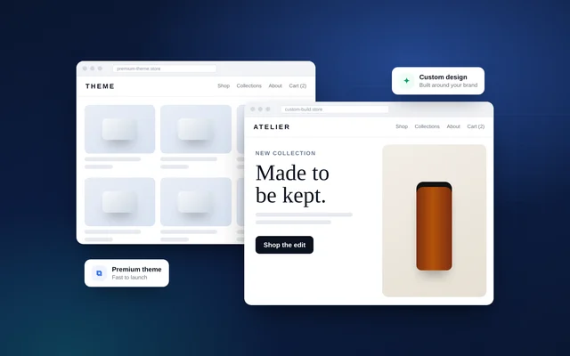
Whether a premium theme can express your identity or you need custom design is a key early decision; compare the trade-offs in custom Shopify theme versus premium theme. For Gulf launches, see building a bilingual Arabic–English Shopify store, and for the full launch sequence read how to launch a Shopify store that sells.
How VEATEX Helps
VEATEX is a Shopify, web and software development agency that also builds Peppol e-invoicing platforms for the GCC, working with clients in the US, UK and the Gulf for over 11 years. We create brand identities for new ecommerce brands and then build them into Shopify stores, so the logo system, palette, typography and tone carry through to every page. Talk to us about your brand identity or see our Shopify development services.
Frequently Asked Questions
What is the difference between a brand, a brand identity and a logo?
A brand is the reputation and feelings people associate with your business. A brand identity is the set of tools you control to shape that perception: name, logo, colour, typography, imagery, packaging and tone of voice. A logo is just one element of the identity. Treating the logo as the whole brand is the most common mistake new ecommerce founders make.
Do I need to register a trade mark before launching an online store?
It is not legally required to trade, but it is wise to search registers before committing to a name and to file early in your main markets. Registration in the UK runs through the Intellectual Property Office, in the US through the USPTO, and in the UAE through the Ministry of Economy and Tourism. A trade mark protects you only in the countries and classes you register.
How many colours should a brand palette have?
Most ecommerce brands work well with one or two primary brand colours, two or three neutrals for backgrounds and text, and one accent reserved for calls to action and sale badges. Fewer colours make a store look more coherent and make it easier to keep buttons and links consistent. Check every text and background pairing against accessibility contrast guidelines.
Can I use a premium Shopify theme and still have a distinctive brand?
Yes, if the identity is strong. Colour, typography, photography style, copy and packaging do most of the work, and a premium theme can carry them well once configured properly. A custom theme becomes worthwhile when your brand relies on layouts, interactions or product presentation that standard sections cannot produce without heavy workarounds.
How do I adapt a brand identity for Arabic-speaking customers?
Choose an Arabic typeface that matches the personality of your Latin type, and test it at small sizes on mobile. Check that your logo works alongside, or in, Arabic script, and that layouts mirror correctly right to left. Write the Arabic tone of voice natively rather than translating English slogans, and review imagery and colour choices for cultural fit in each Gulf market.
How long does it take to create a brand identity?
For a new ecommerce brand, a focused identity project covering positioning, naming support, logo system, palette, typography and basic guidelines typically takes several weeks, and packaging adds more. Time goes mostly into decisions and feedback rounds rather than design production. Trade mark searches and any objections can also extend the timeline, so start them early.
Sources
- Managing brand assets — Shopify Help Center
- Theme settings — Shopify Help Center
- Understanding Success Criterion 1.4.3: Contrast (Minimum) — W3C WAI
- Register a trade mark — GOV.UK
- Search our trademark database — USPTO
- Trademark services — UAE Ministry of Economy and Tourism
Facts checked against the sources above as of 6 Oct 2026. Rules and platform features change, so confirm time-sensitive details before acting.

VEATEX Editorial Team
Written by the strategists, developers and e-invoicing engineers at VEATEX, a Shopify, web and software development agency that also builds Peppol e-invoicing platforms for the GCC, with 1,200+ projects delivered over 11+ years. About us